Jay was approached through an agency asked to create a logo and label design for a vodka brand.
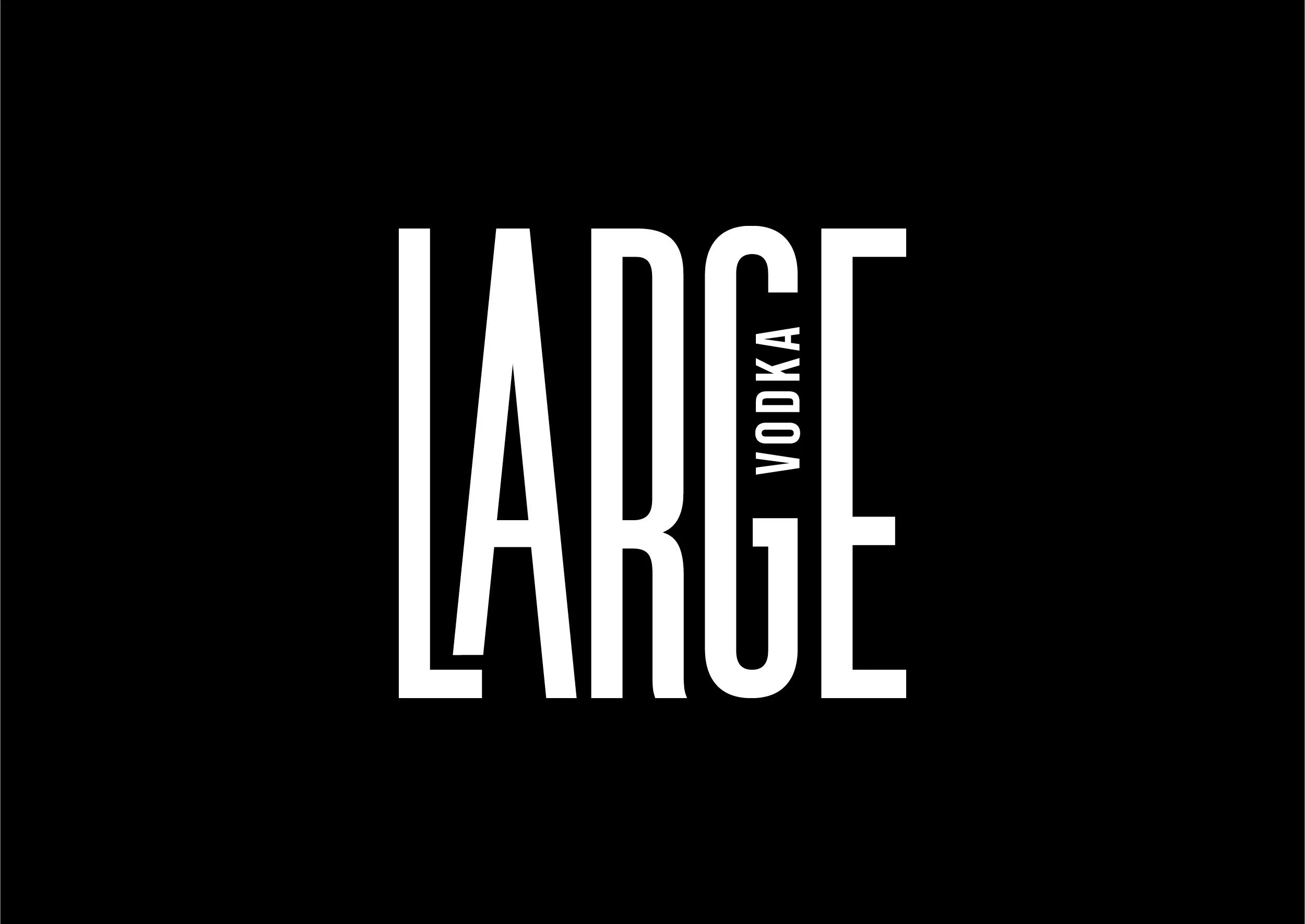
Originally they had the strap line of ‘Avin it Large’ which was reminiscent of Kevin and Perry go Large back in 2000. Their audience was for a younger generation and so the phrase now felt outdated. Opting to use just ‘Large’ as the name was a good compromise to capture the vibe they were aiming for, while bringing into the present day.
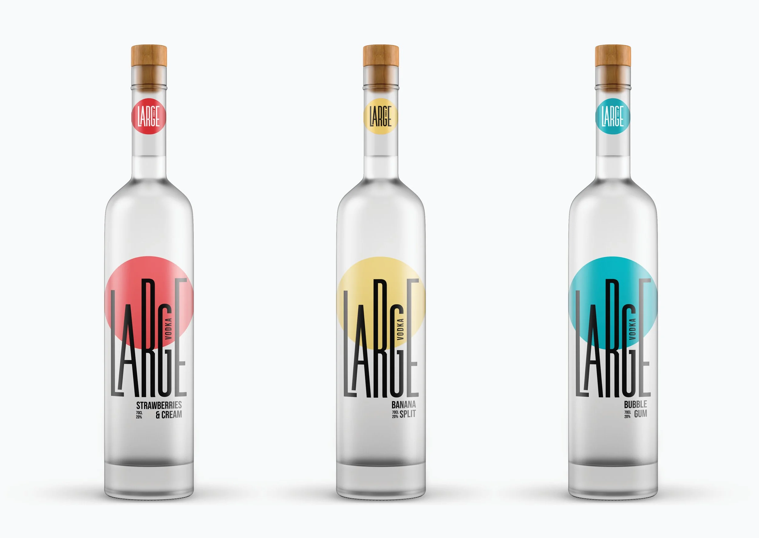
Jay created a bold custom lettering idea, which worked with the tall bottle selection that could be easily adapted for all the other flavours. The letters indicated tall buildings with the circle being the sun setting behind them. The circe simply changed colour for each flavour, creating a simple and adaptable design that worked well for smaller bottle sizes too.